Mangue.bit
how to capture the essence of Mangue.bit, the largest startup conference in northeast Brazil?
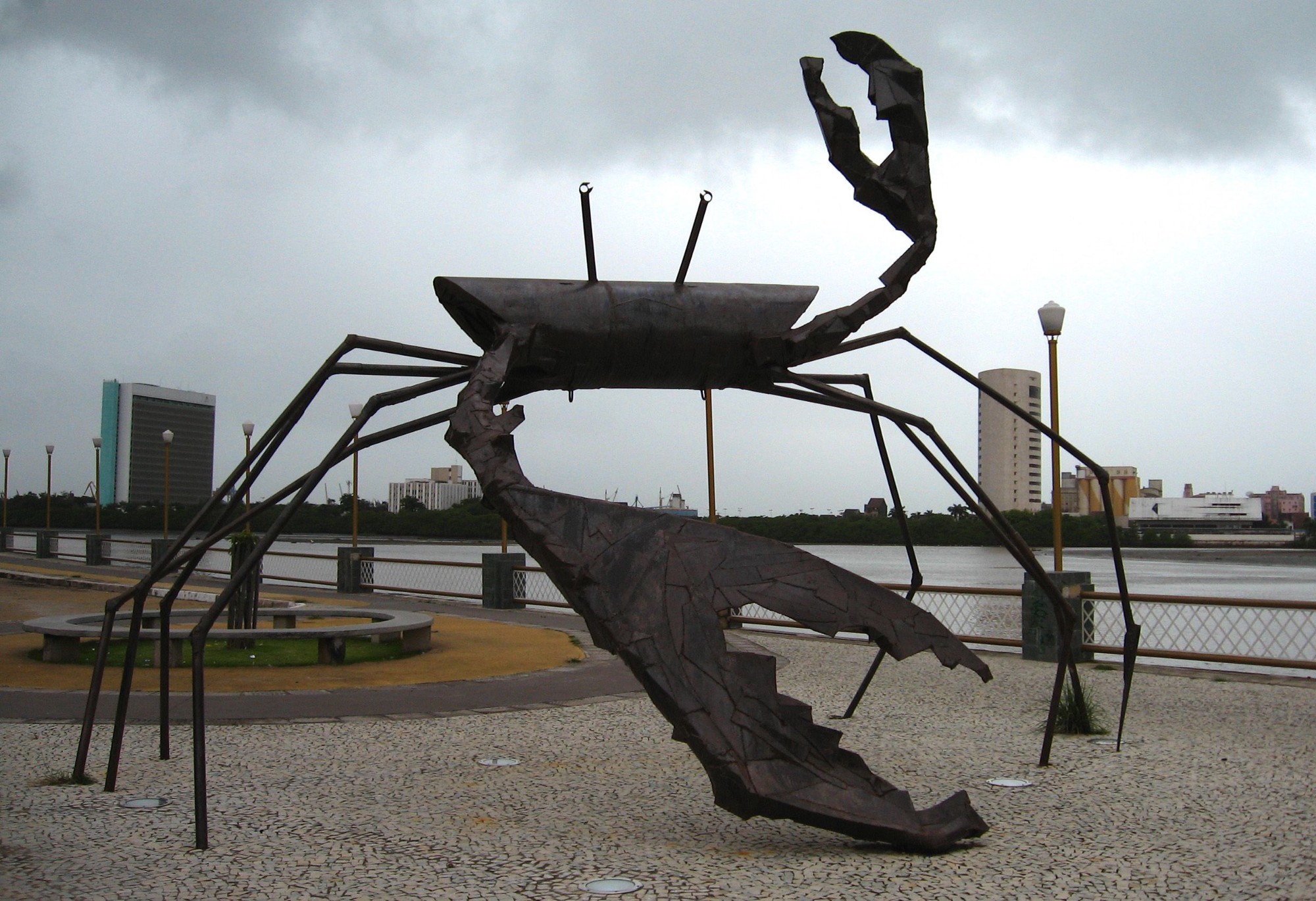
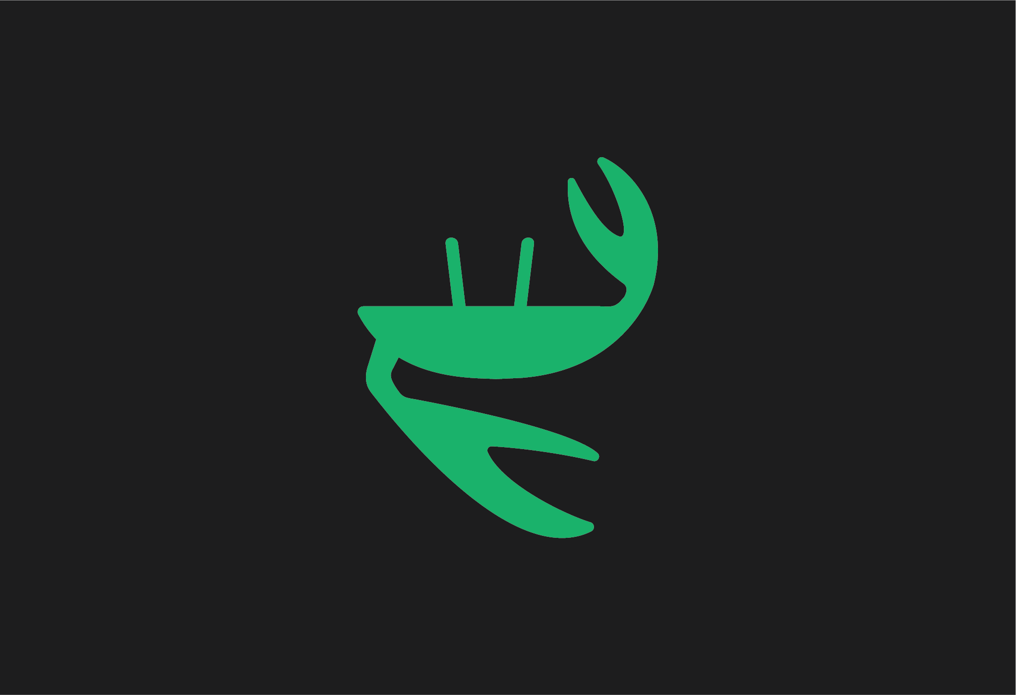
In 2006, the startup community in Recife (PE, Brazil) faced a challenge: organizing what would become the largest startup and entrepreneurship conference in Pernambuco (in a straight line, haha). I had always been part of this community, called Manguez.al, so I fully embraced the project. Through Estúdio Cargo, my design studio, I started thinking about a symbol that could represent the essence of the event. Since the name references the Mangue Beat musical and artistic movement, the crab became the central inspiration. Drawing from the famous crab statue on Rua da Aurora, Recife (PE), I designed the “drumming crab” icon, as if its claws were playing drumsticks on an alfaia.

In partnership with Breno Chamie, also from Estúdio Cargo, the Mangue.bit – A Startup Conference brand was born. The addition of bold typography gives strength to the visual identity. Furthermore, the “bit” features pixel elements, referencing the digital unit “bit” and reinforcing the event’s digital technology foundation.
The first edition of Mangue.bit took place on March 31, 2016, at Empresarial JCPM in Recife, PE.
Mangue.bit 2.0: How to update and adapt the identity for a second edition without losing its essence?
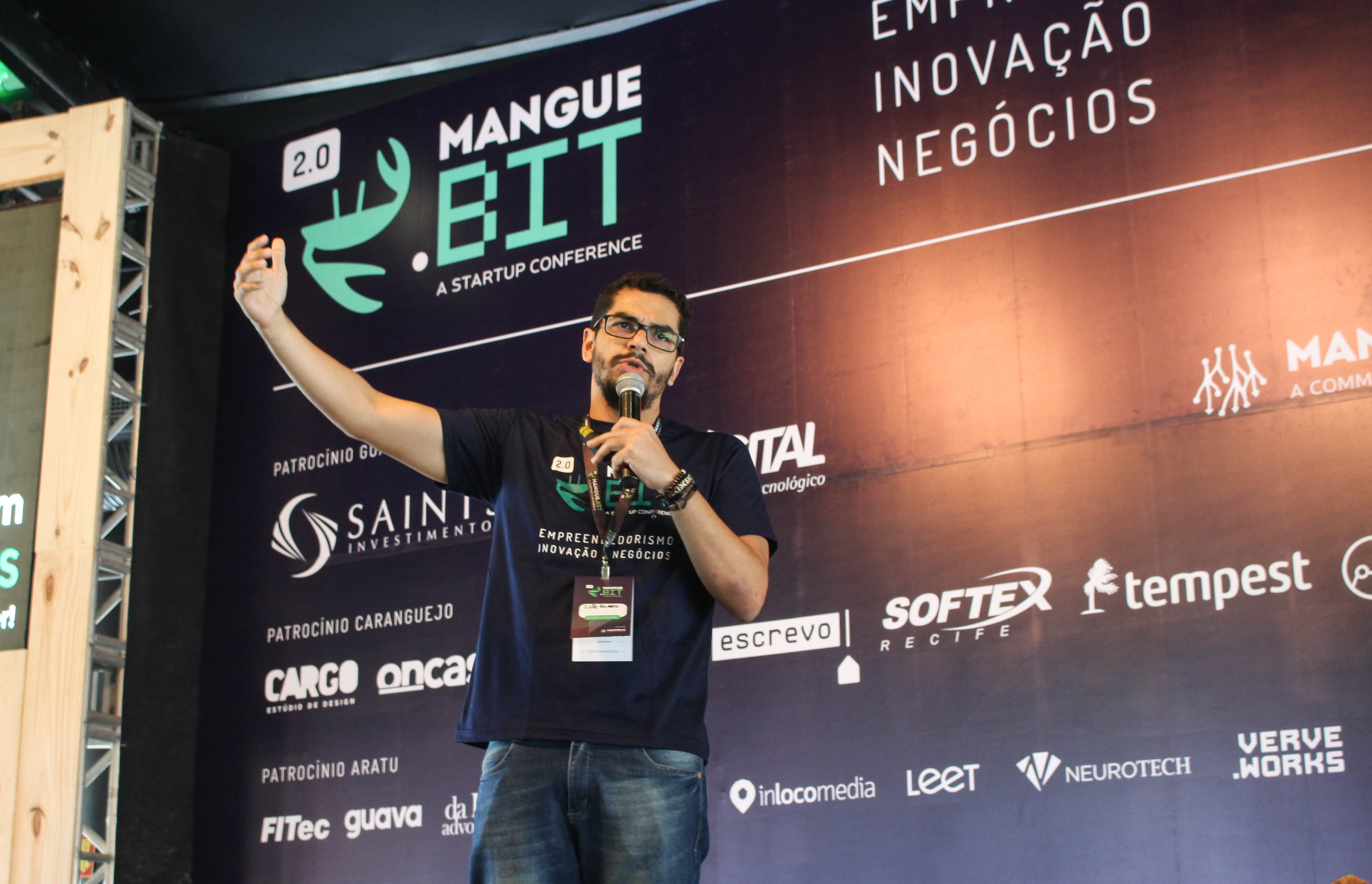
With the success of the first edition, the Manguez.al community organized the second version, Mangue.bit 2.0, on May 4, 2017, at Arcádia Paço Alfândega in Recife, PE. The challenge was to update the brand without losing its core essence. With that in mind, Breno Chamie and I came up with the idea of adding the “2.0” element above the logo to indicate the event’s second edition, while also referencing technology, system updates, and version 2.0 concepts.

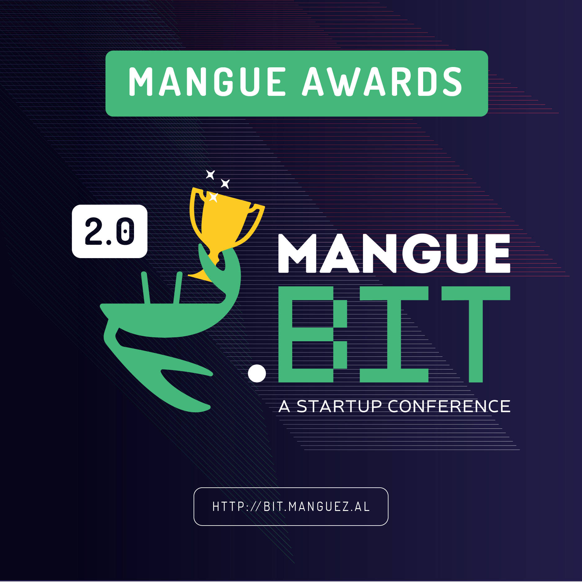
During the event, some startups and community members received specific awards. This composition was used to promote the Mangue Awards on social media.
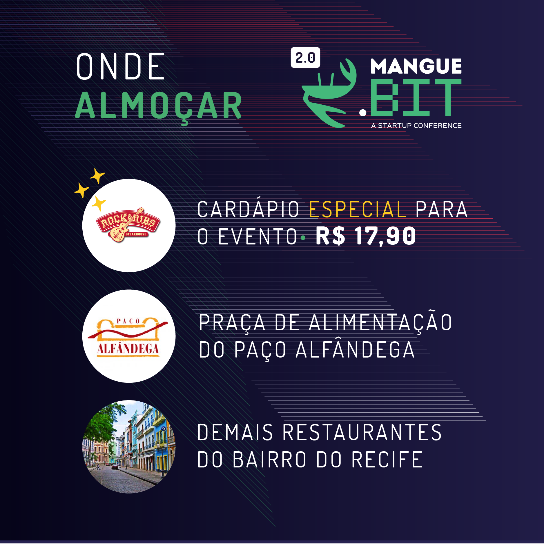
Additionally, the event partnered with nearby restaurants to offer a special menu and suggested other dining options for lunch. This composition was used to share this information on social media.
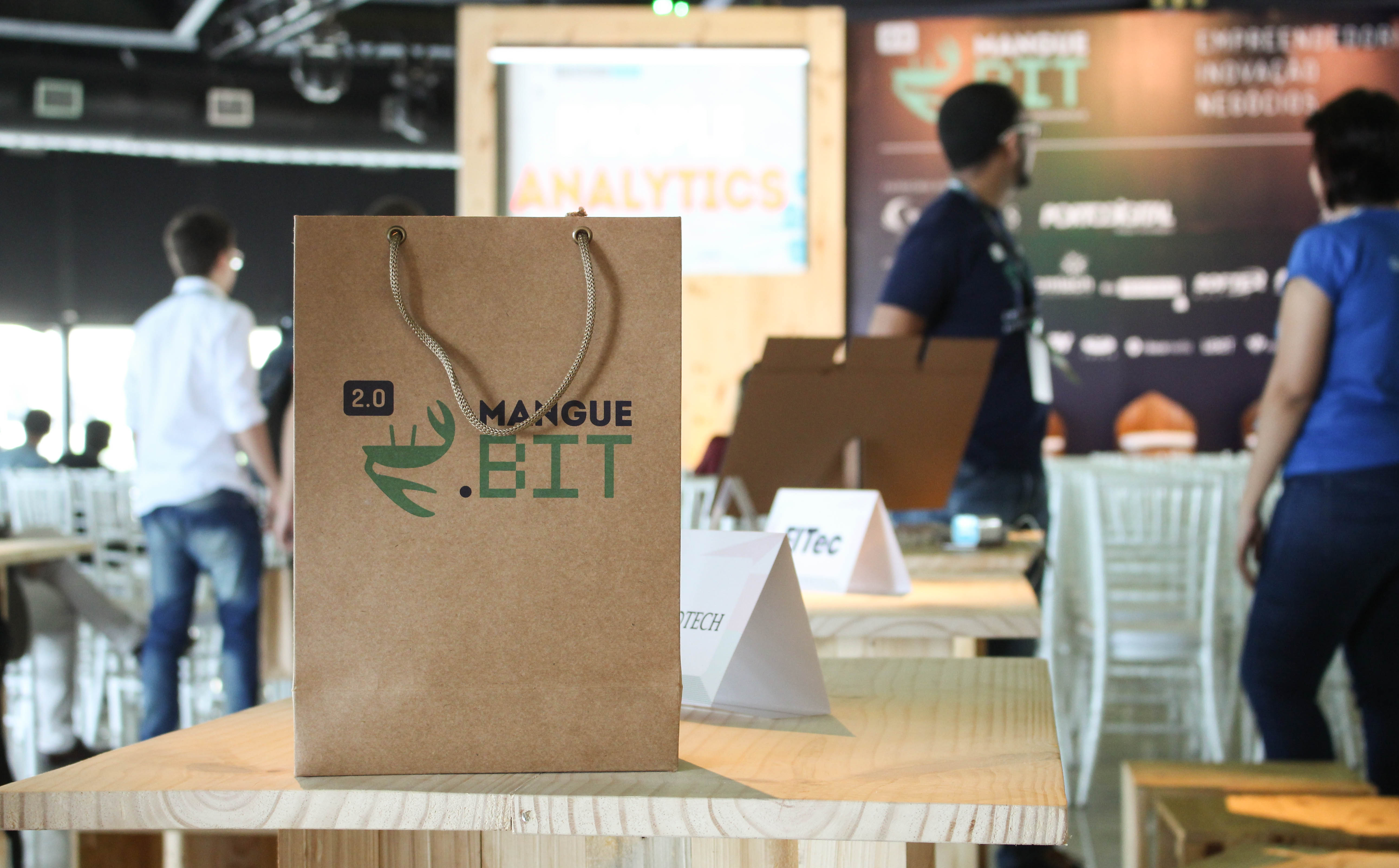
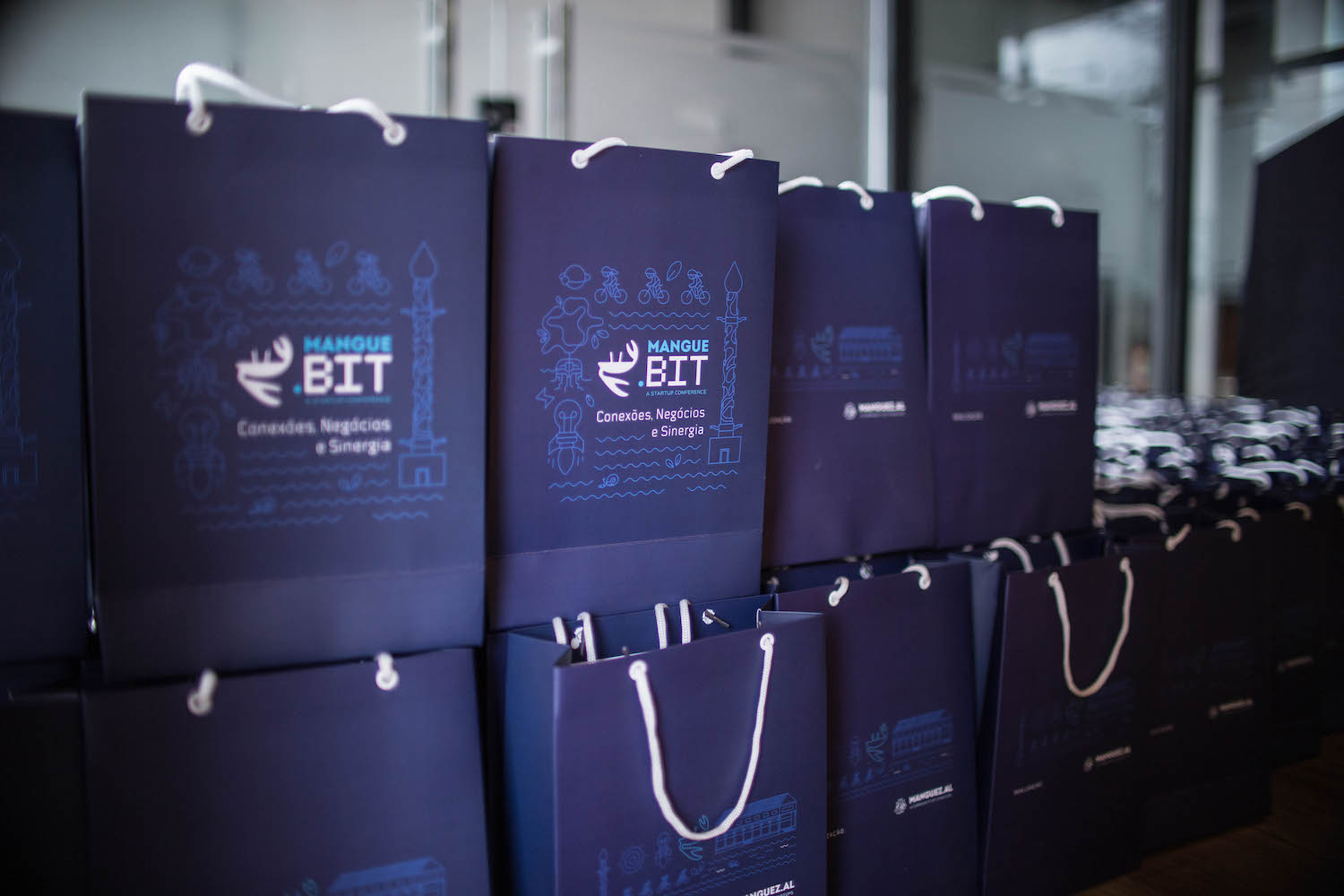
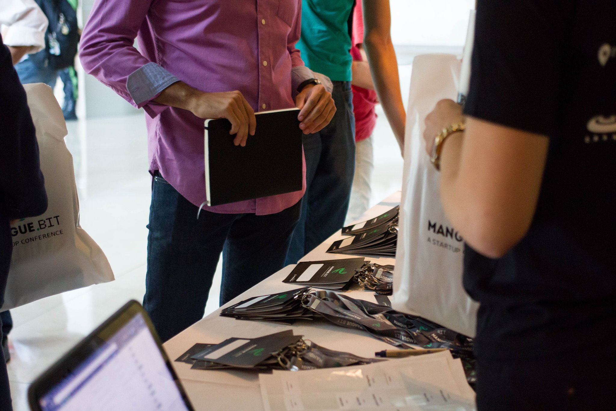
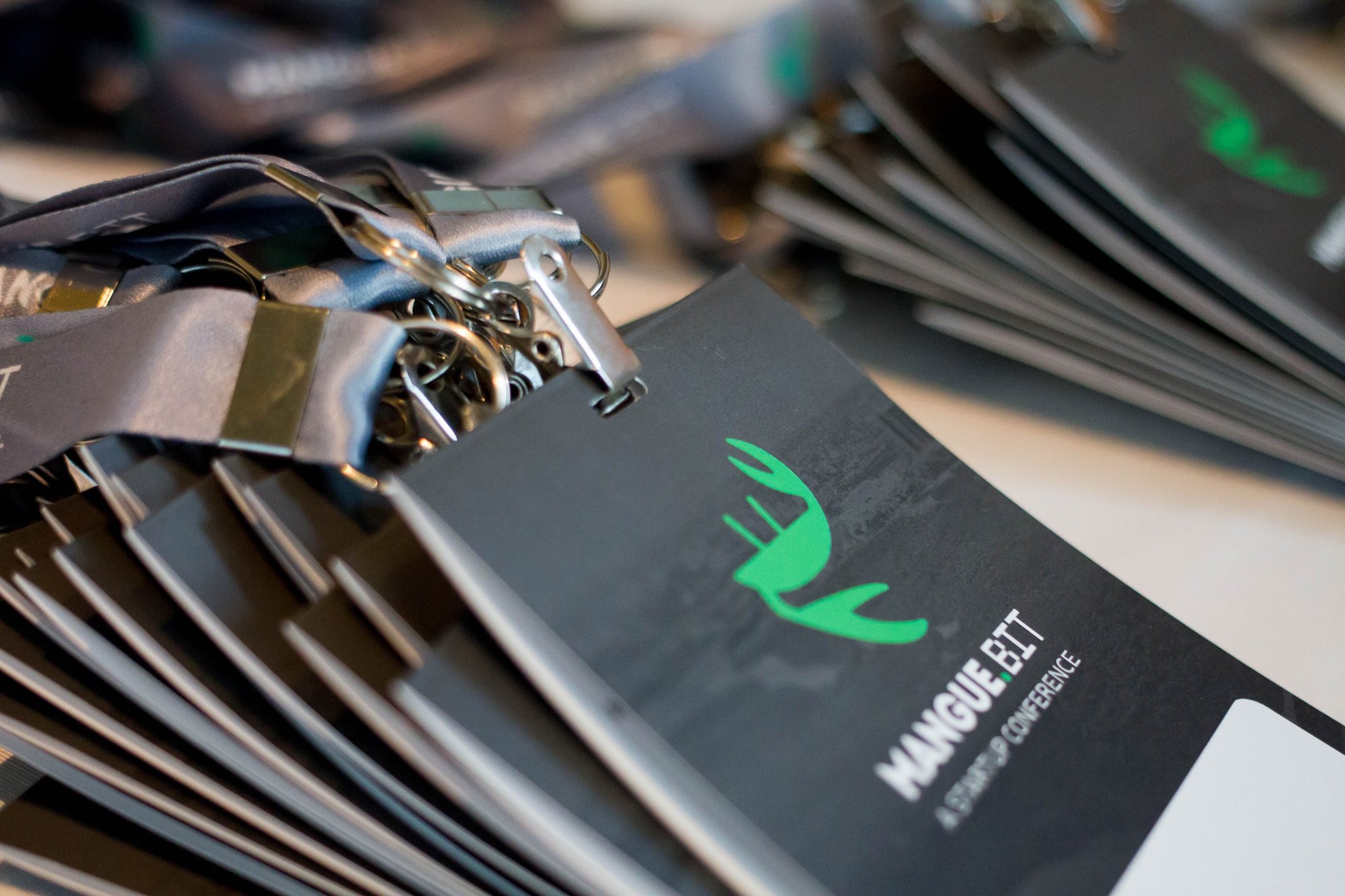
Brand application on kraft bags, which were used to hold the event giveaways.
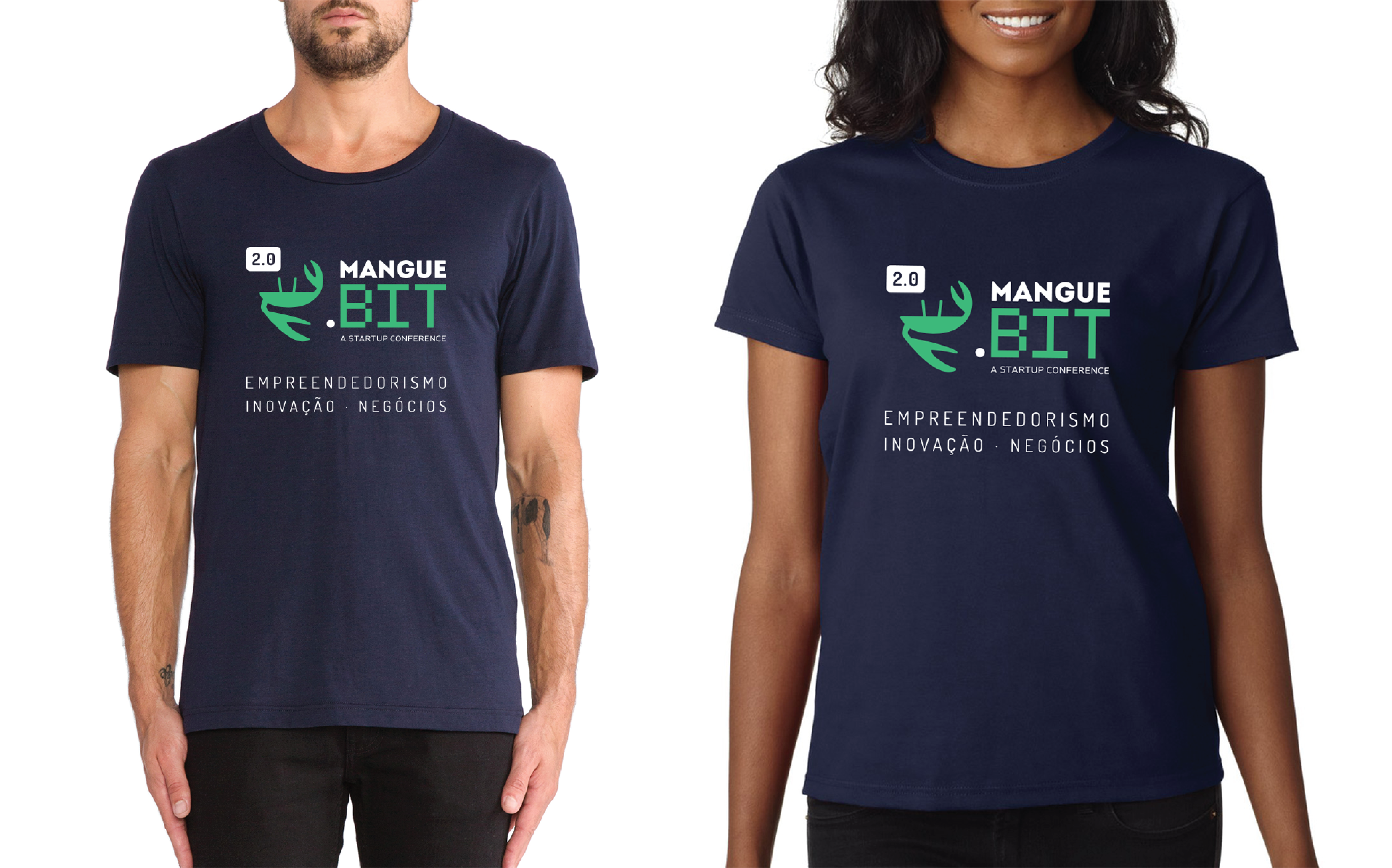
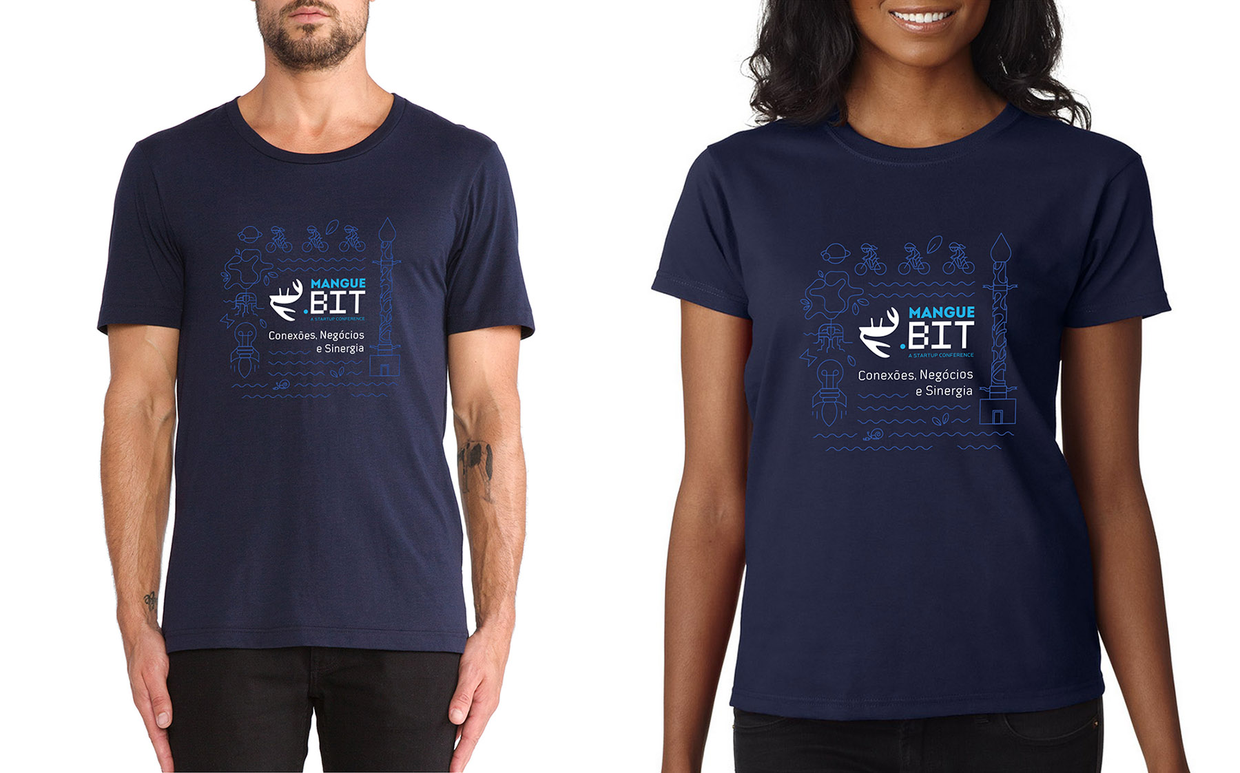
Brand application on the event T-shirts.
Mangue.bit 3.0: a more mature and professional event, yet still true to its community essence.
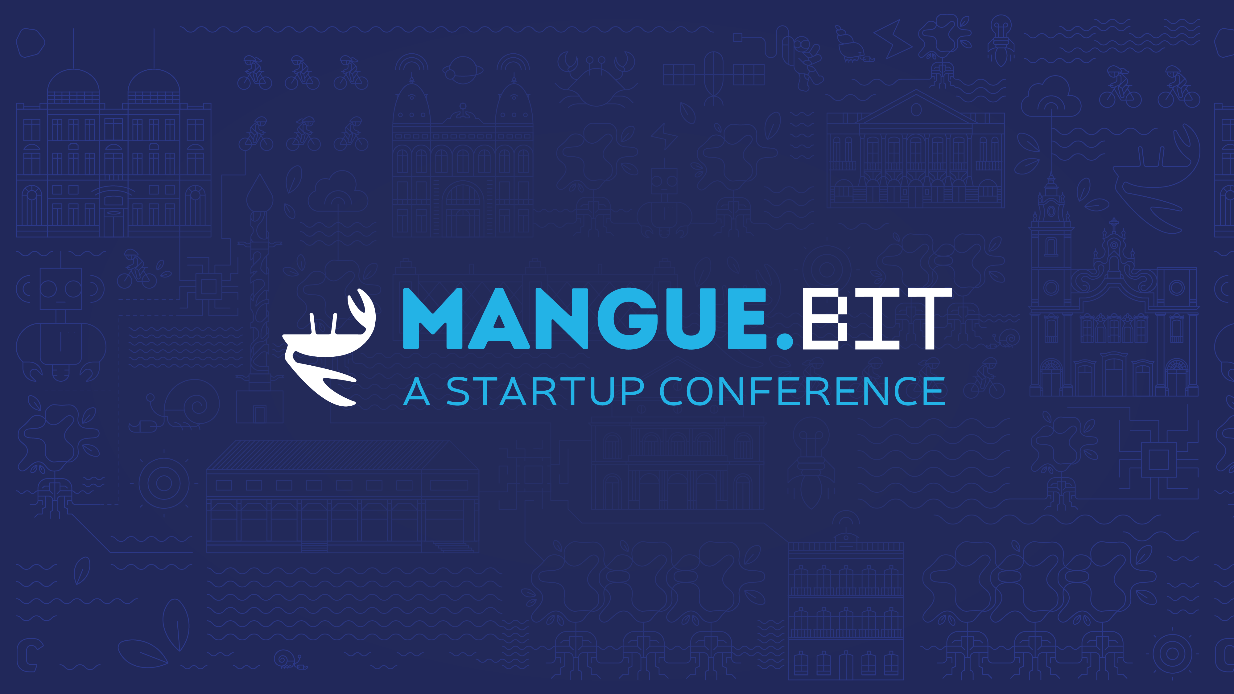
The challenge for the visual identity of the event’s third edition was to keep up with its evolution, as it became more mature and focused on strengthening the connections built by the community’s startups, without losing its essence. With this in mind, Breno Chamie and Leonardo Martins adapted the original brand, introducing shades of blue and incorporating an iconographic pattern designed by Leonardo Martins.
Mangue.bit 3.0 took place on September 13, 2018, at Itaipava Catorze, in Bairro do Recife (Recife, PE).